Home
Adding context to a search feature that only knew numbers
How a legacy search built for reference numbers was redesigned around plain-language descriptions.
Nivoda is a B2B marketplace connecting jewellers with diamond and gemstone suppliers globally
How it started.
Nivoda's search only understood reference numbers. A buyer who knew a certificate or stock number could find that stone. A buyer who typed
got nothing back. Searching across categories meant a separate global search: a lightbox with a tab for each category, which rarely returned results. Competitors already let buyers search in plain language. The goal was to let buyers describe what they need, in their own words, and find it anywhere on the platform, from products to orders, requests and invoices.
It looked like a capability upgrade. It turned out to be a data infrastructure problem.
The data pointed to a discovery problem, not just a UX issue. Search was a meaningful part of the buying journey, yet the existing experience struggled to interpret many of the queries buyers entered.
~ 31K
searches/month
Around 31,000 web searches per month were recorded in the PRD
~ 40%
no results
Roughly 12,200 searches per month returned no results
~ 58%
non numeric
Around 58% of searches that returned no results were non numeric
A separate analysis reported that around 40% of searches led to an add-to-cart within 24 hours between September 2024 and January 2025. Search was where buyers with clear intent went, and it was failing most of them.
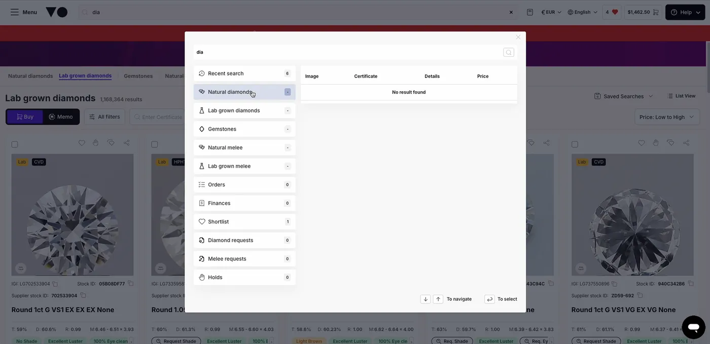
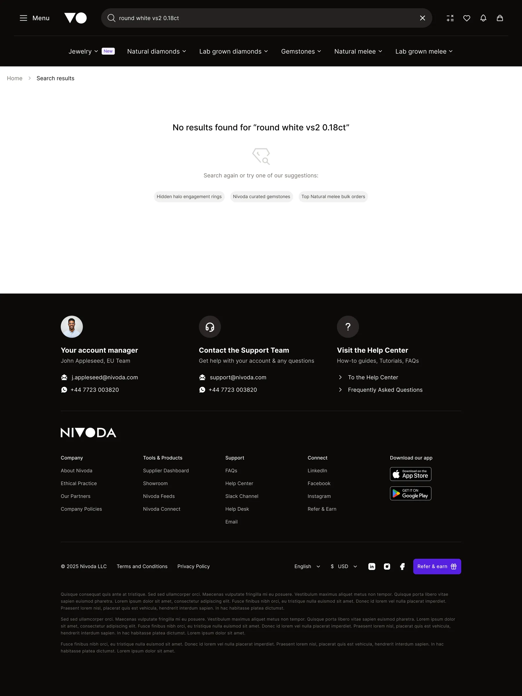
Legacy Search feature returning no results
Identifying the problem.
As the project kicked off and alignment with engineering began, the underlying constraint became clear: platform data was spread across a heavily segmented database, and only some product data was ready for the newer search technology. Transactional data, such as orders and invoices, was not yet supported.
Design and engineering progressed in parallel. I focused on shaping the new search experience through research, design critiques and technical alignment, while engineers investigated the infrastructure and evaluated technical approaches.
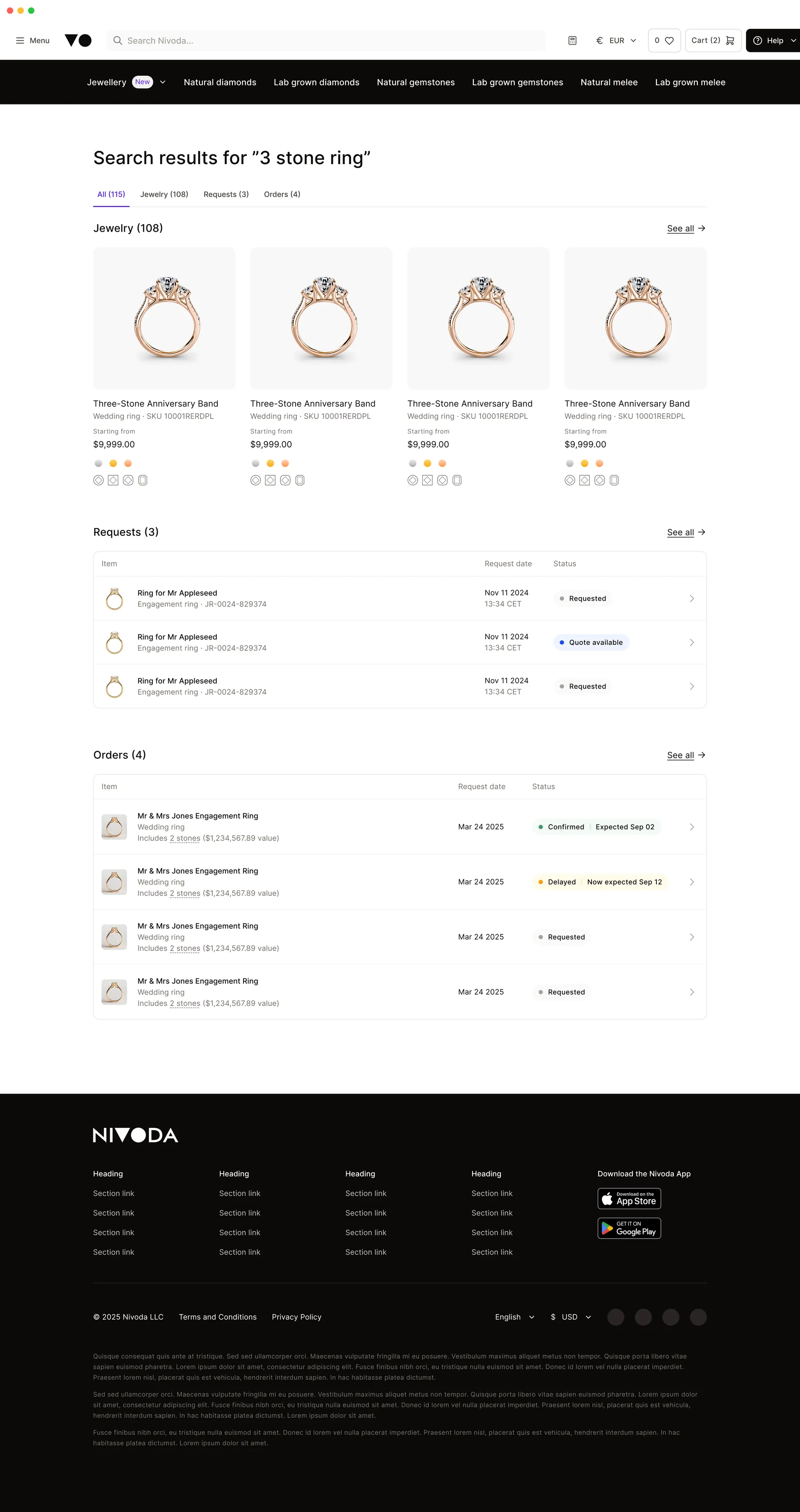
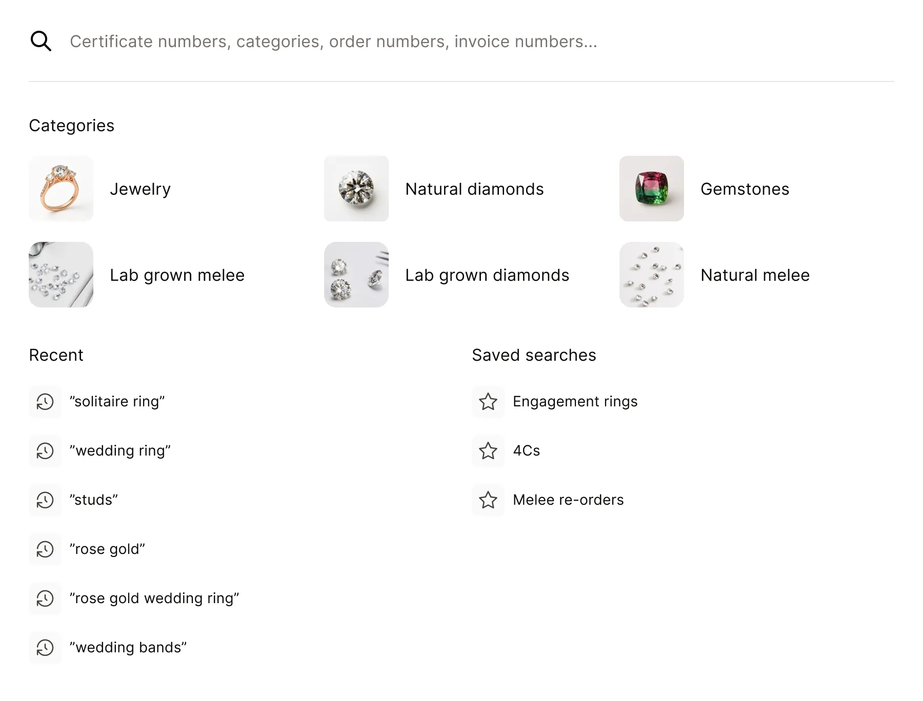
The experience needed to accommodate different kinds of records, different result structures and data sources that were not all equally ready.
What didn’t work.
I benchmarked search patterns across large marketplaces and tools, then evaluated them against Nivoda’s B2B context:
-
Query parsing
Didn't work
Turning search queries into filters applied on a listing page seemed aligned with how buyers searched. However, the approach introduced two challenges: it was an unfamiliar interaction pattern for non-technical users, and it had already been ruled out in previous explorations due to technical complexity.
-
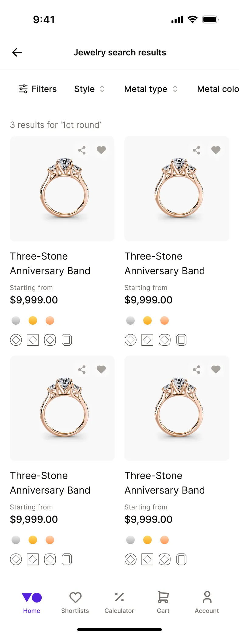
Search In Its own tab (mobile)
Didn't work
Giving search a permanent place in the mobile navigation would have competed with tools buyers needed readily accessible, such as Shortlists and the Calculator.
-
Mixed results page
Didn't work
Showing every product type in one list, mixed fundamentally different categories in a single view. Buyers need to compare dense technical details, but a diamond and a ring have different attributes and serve different comparison needs.
Patterns that work for consumer shopping don’t always translate to a B2B context, where buyers compare products using dense, technical information.
The reframe.
“How might we enable buyers to search Nivoda in their own words while delivering the experience incrementally?”
One search per category first, global search later.
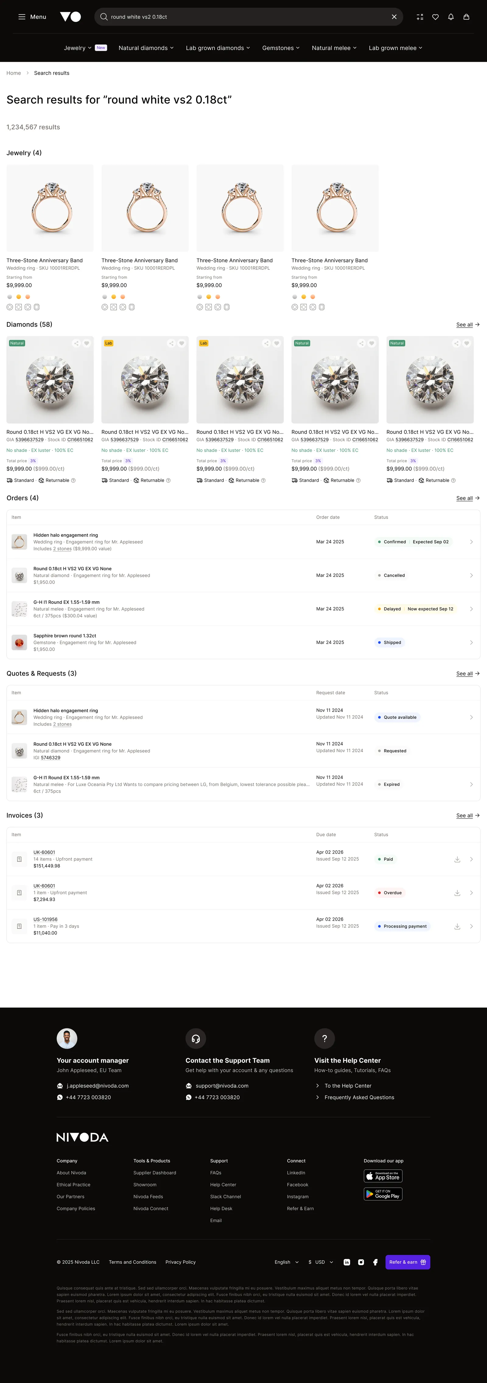
The vision remained a single global search, delivered incrementally as each category’s data migrated to OpenSearch. This would allow us to release value earlier, gather usage data and refine the experience while the infrastructure evolved. I split the design work into two complementary tracks:
Functionality
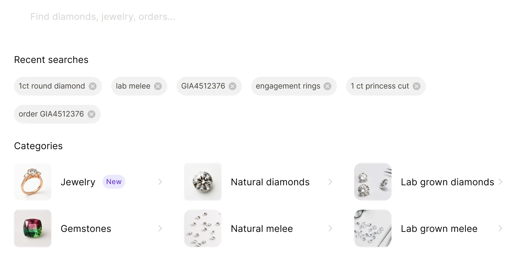
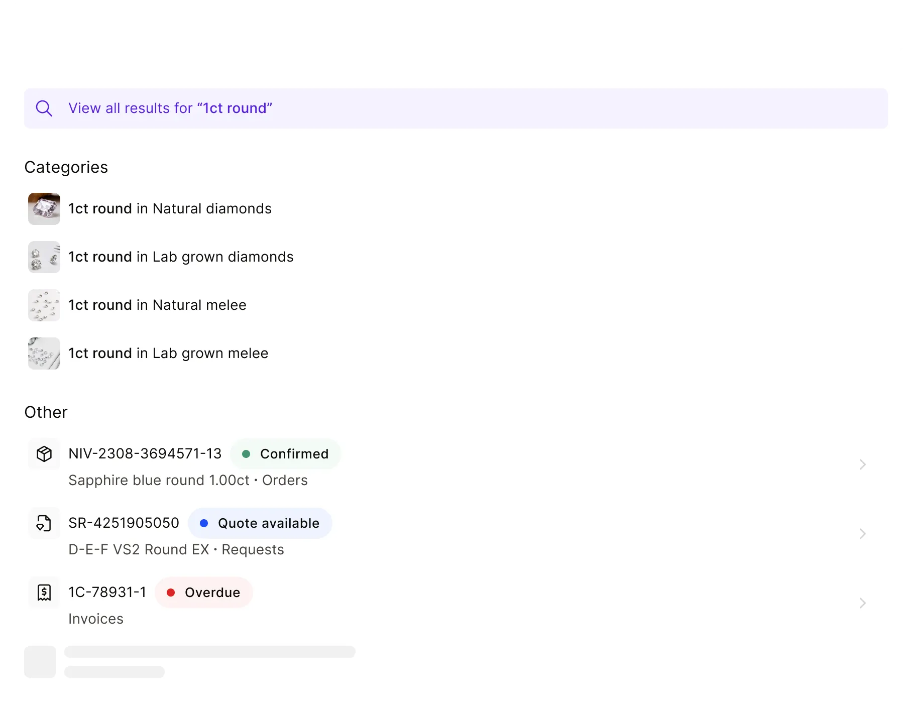
I built a Lovable prototype using a realistic dummy dataset modelled on our data structure to explore core search interactions, result types and edge cases with engineering, making the intended behaviour tangible to inspect and discuss before implementation.
User experience
I took the designs through three critiques, covering the web search spotlight and results, the coded prototype, and mobile. The feedback helped refine the information hierarchy and clarify how the same search model should adapt to different screen sizes.
Validation.
I ran two rounds of unmoderated usability testing using Useberry, with participants recruited through Prolific.
-
Round 1
Test on Lovable coded prototype
10 participants
Web
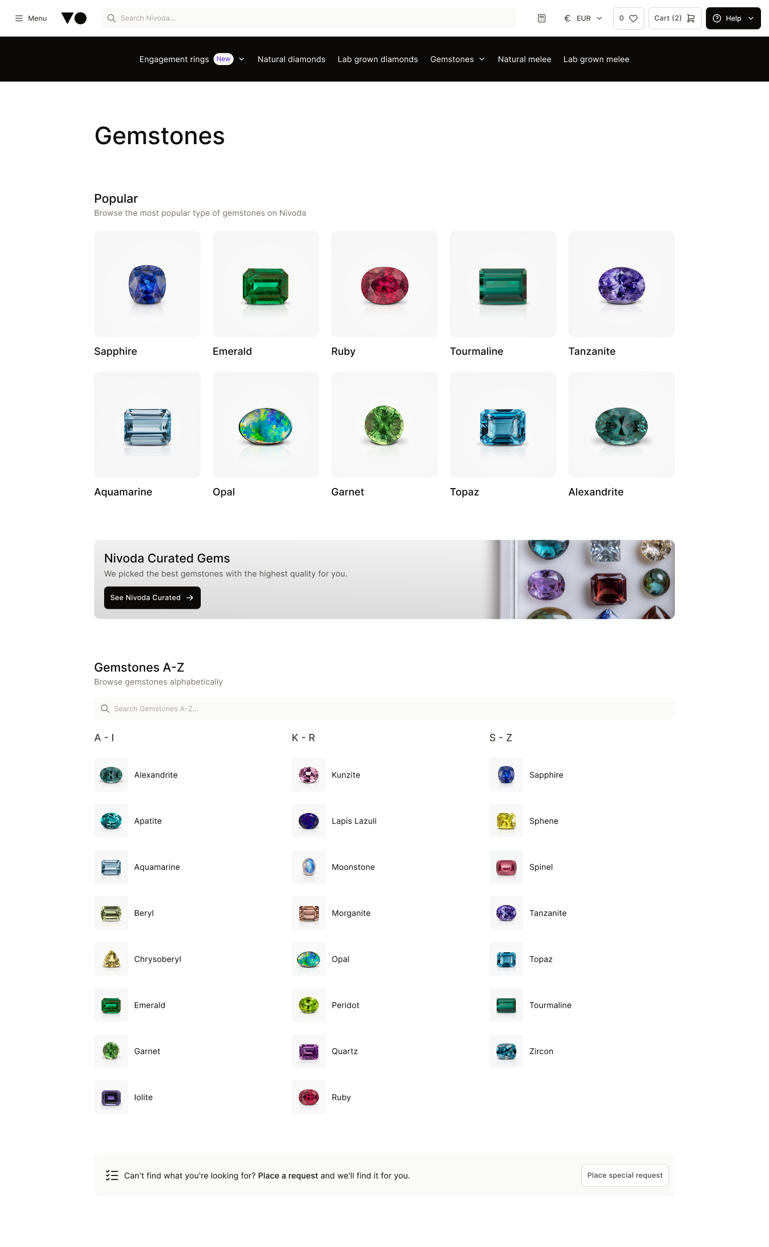
On desktop, most participants could find products using natural language queries. 9 out of 10 found a 3-carat engagement ring in around 23 seconds and all reached Gemstones. However, distinguishing orders from products proved less clear. Participants reached the target order but several navigated through product pages first. Suggestions were also frequently overlooked.
-
Round 2
Test on Figma interactive prototype
14 participants
Mobile
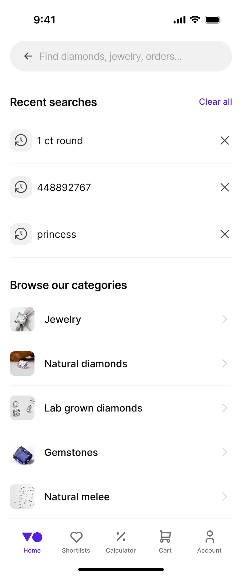
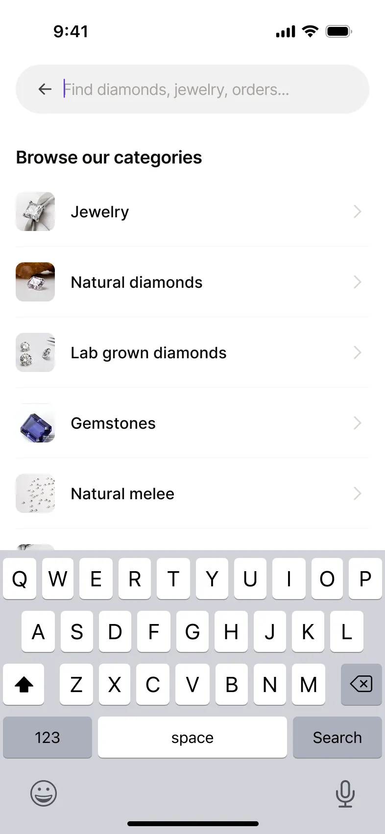
On mobile, 12 of 14 participants opened a category when exploring what the app offered. For a specific-diamond task, 55% selected a suggestion and 45% typed their query. This indicated that search and browsing served different needs, and that the mobile entry point needed to support both.
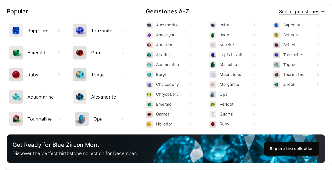
Testing led me to simplify the search spotlight, reducing information at the first level and making category distinctions more prominent. This strengthened the hierarchy between browsing available categories and exploring query-specific suggestions.
Outcomes.
The work brought the contextual search vision into a concrete, tested design direction for web and mobile. The problem was quantified using existing search analytics and key interaction patterns were tested and iterated. Testing with actual Nivoda buyers and validating performance and relevance against the live OpenSearch implementation remained necessary next steps.
Engineering had a concrete design reference for a feature intended to support incremental delivery.
What this project taught me was how to keep design moving when the roadmap wouldn’t hold still. I focused on making the work ready to move forward whenever the opportunity arose. The core patterns were defined before the July pause, anticipated engineering constraints were factored into the design, and web and mobile specs were ready for handover. With limited access to customers, I used the feedback channels available to reduce uncertainty: peer critiques to refine the experience, a coded prototype to align with engineering, and unmoderated testing to evaluate usability. Each provided a different perspective, helping me build confidence in the design and prepare it for implementation.